Dunedin Aurora
A Citizen Science Magnetic Observatory located in Dunedin, New Zealand.
Welcome to Dunedin Aurora!
Dunedin Aurora is a citizen science magnetic observatory located in Dunedin, New Zealand. Our main objective is to provide near real-time space weather data to allow people to know if an aurora is likely to be happening!
Unlike 99% of other space weather sites, we run our own magnetic sensors, so we know what is going on. If NOAA or NASA crashes, we keep going!
Main Dashboard
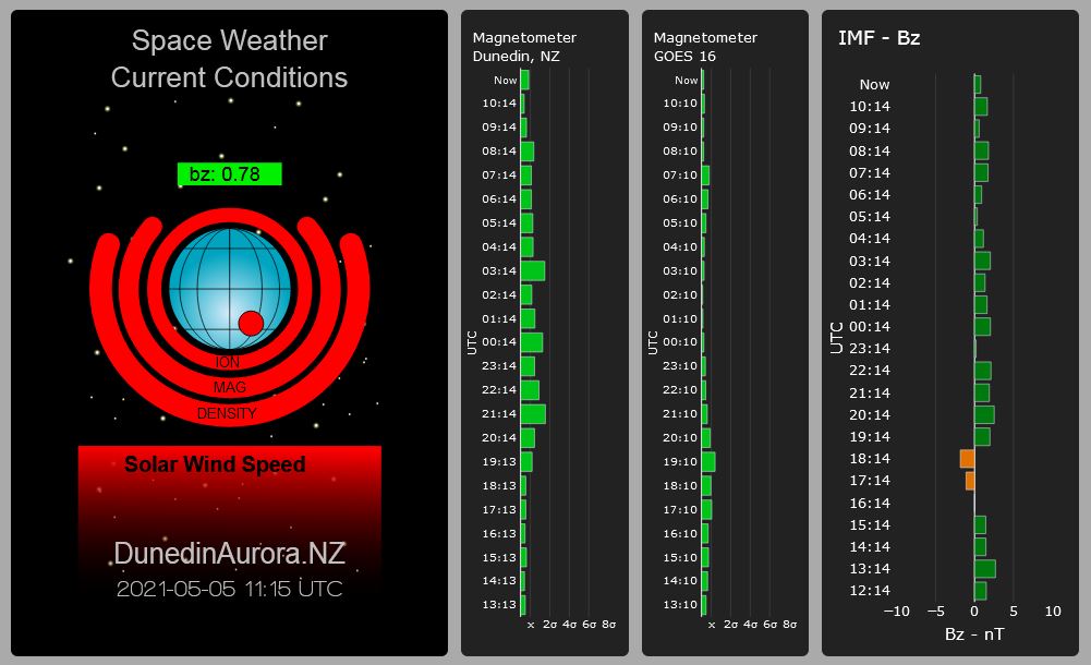
The dashboard at Dunedin Aurora tracks the Earth's magnetic field, and how it is influenced by the solar wind. The solar wind is hot, fast moving plasma that constantly streams from the Sun. When this plasma interacts with the Earth's magnetic field it can cause displays of the aurora. The dashboard presents a simple view of space weather conditions and more accurate information can be found by clicking on the "Magnetograms" button in the menu.
The more orange and red you can see on the dashboard, the more active space weather is, and the more likely you are to see an aurora from southern New Zealand.
Master Display
The master display is a simple picture of the space environment near Earth. Surrounding the globe are a number of layers that will become visible and change colour depending on what is happening.
Globe
The globe shows conditions "on the ground". The circle on the globe represents magnetic conditions observed at Dunedin Aurora.
Bz
This label shows information on the Earth's magnetic field as measured in space. When Bz is negative there's a much higher chance that highly charged particles in the solar wind will be funnelled by the Earth's magnetic field to the north and south poles and cause an aurora.
Ion
This layer shows the conditions of the ionosphere. The ionosphere is the part of the atmosphere that gets charged every day by solar radiation. The ionosphere can become turbulent when hit by space weather and this affects signals from satellites. At Dunedin Aurora we monitor signals from GPS satellites to track this turbulence.
Mag
THis layer shows the state of the magnetic field from the position of the GOES 16 satellite in geosynchronous orbit above Earth.
Density
This layer shows the density of the solar wind as it passes by the DISCOVR satellite. An increase in density can be seen as a "shock wave" that warns of approaching blobs of solar wind.
Solar Wind Speed
High solar wind speeds are the main drivers of space weather. Wind speeds over 500km/s can lead to an aurora. The bar for solar wind speed will appear once solar wind speeds are over 400km/s.
Horizontal Bar charts
The three charts provide information on magnetic conditions for the last 24 hours. The magnetometer charts show how active the magnetic field is. More activity means increased chance of an aurora. We show this activity in relation to a typical calm day, so the bigger the bars, the more active conditions are.
We don't try to calculate the K-index at Dunedin Aurora as the K-index is for activity in 3 hour chunks. Among it's problems is that it's not sensitive to quick and sudden changes in space weather conditions, or a single spike in readings can imply a whole three hour period of auroral activity.
The chart for the IMF (Interplanetary Magnetic Field) is useful as strongly negative values correlate with auroral displays.
Moon Clock, Skycam, Tweets
These three panels show the current phase of the moon, a current image of the sky as seen from Dunedin, and the latest tweets from Dunedin Aurora
Forecast, Coronal Holes, LASCO Coronagraph
Forecasts
An abbreviated version of the full forecast graphic from the forecast page, this shows the predicted strength of the solar wind and it's relationship to visible auroral displays
Coronal Holes
The CH monitoring software produces this graphic and shows coronal holes that are significant enough to direct high speed streams of solar plasma towards Earth.
LASCO Coronagraph
Coronagraph data from the SOHO satellite are processed to try and provide rapid warning of coronal mass ejections. The software monitors a circumferential zone around the sun and looks for the change in brightness, as well as determining if there's enough coverage to identify halo CMEs. The coronagraph images are only updated by the SOHO Team infrequently, so we only check every four hours for new pictures.
The animated GIF shows the last 24 - 48 hours of CME activity. This is a highly processed image that has been reshaped to make it easier for a computer to parse it. CME detail is very faint in the original images and is close the the "noise floor" - the visual "snow" is static and other defects but CMEs can be seen as the large masses moving up the image.
The software also generates a text warning based on the most recent data and a link to the STEREO A satellite repo for conformation images. STEREO A gives us a side-on view of the sun and be helpful to triangulate the direction of travel for a CME.
The graph shows the count of pixels in the detection zone that indicate an outburst of solar plasma. Lines indicating approximate levels of activity are shown.
Threshold Values for Colours
| colour ⇒ | none | green | orange | red |
|---|---|---|---|---|
| Globe | (green) Background levels. | Minor activity | Moderate activity. | Highly active. |
| Ion | (< 2 sigma) Very calm. | (>2 sigma) Minor disturbance. | (>4 sigma) Moderate disturbance. | (6 sigma +) Major disturbance. |
| Magnetometer (GOES 16) | Minor activity | Moderate activity. | Highly active. | |
| Solar wind Density | Less than 10p/cm3 | Over 10p/cm3 | Over 20p/cm3 | Over 40p/cm3 |
| Solar wind speed | Under 400km/s | over 400km/s | Over 500km/s | Over 600km/s. |